Heatmaps have been all the rage this week. I was driving down US-23 to Ann Arbor last Monday and heard Jim Cramer introduce the thing to Erin Burnett. My first instinct was that we’d see something like this, followed by a rant from Mark Haines. However, the real thing turned out to be much more tame and reasonable.
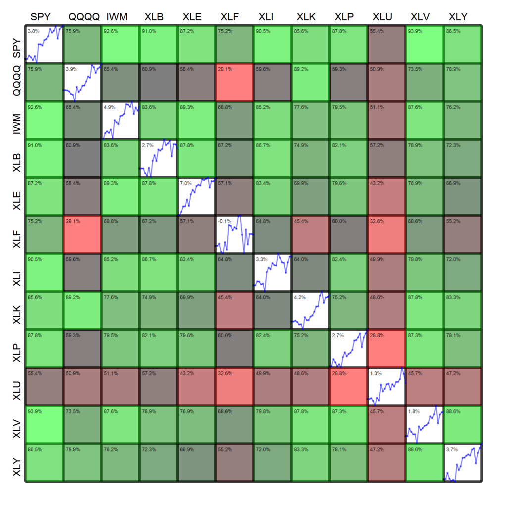
Now that heatmaps are en vogue, I figured I’d take my own shot at one. I’ve always been a fan and use them in publications, but there’s a very fine line between conveying large amounts of information intuitively and just overloading the viewer. The figure below shows two pieces of information simultaneously:
- The diagonal cells show the cumulative log-return time series of each asset over the past month. The upper left hand corner of the diagonal cell displays the past month’s return.
- Off-diagonal cells show the color-coded correlation between assets. For example, reading across the first row shows the correlation of each asset with the S&P 500. Reading the figure indicates that the S&P 500 (SPY) has a correlation coefficient of 75.9% with the Nasdaq (QQQQ) and 92.6% with the Russell 2000 (IWM). The upper left hand corner of these off-diagonal cells displays the correlation coefficient.
Please let me know what you think of the figure, pro or con. If you’ve got any other suggestions, also feel free to leave a comment. Note that there are a still a few “degrees of visualization freedom,” e.g., thickness of cell borders, opacity of cells, plenty of free pixels in the interior of cells. For instance, how would you suggest I convey information about the volatility of each fund over the week?
