I regularly publish papers on arXiv.org, an open-access archive for research in physics, math, computer science, and (recently) quantitative finance.  I also subscribe to digest updates on recently published research.

Edit: It’s unclear whether the in-sample issue actually affects the prediction or whether this is only used to compare OF and GPOMS.  Though the regressions are written using  X_t and not Z_{X_t},  Figure 3 and its accompanying interpretation clearly compare the z-scores of $DJIA and their chosen signals.

I noticed an interesting paper hit the digest tonight: Twitter mood predicts the stock market.  Though I haven’t read it in detail, the paper suggests that sentiment analysis of Twitter can be used to improve the prediction of market direction.  My quick scan of the paper found it to be mostly out-of-sample, though it appears that the OpinionFinder (OF) and Google Profile (GPOMS) data are normalized with symmetric windows that do incorporate in-sample data.  However, the degree of improvement in prediction suggests to me that this sentiment analysis might improve prediction even when this issue corrected.  Below is the abstract and full citation:

“Behavioral economics tells us that emotions can profoundly affect individual behavior and decision-making. Does this also apply to societies at large, i.e., can societies experience mood states that affect their collective decision making? By extension is the public mood correlated or even predictive of economic indicators? Here we investigate whether measurements of collective mood states derived from large-scale Twitter feeds are correlated to the value of the Dow Jones Industrial Average (DJIA) over time. We analyze the text content of daily Twitter feeds by two mood tracking tools, namely OpinionFinder that measures positive vs. negative mood and Google-Profile of Mood States (GPOMS) that measures mood in terms of 6 dimensions (Calm, Alert, Sure, Vital, Kind, and Happy). We cross-validate the resulting mood time series by comparing their ability to detect the public’s response to the presidential election and Thanksgiving day in 2008. A Granger causality analysis and a Self-Organizing Fuzzy Neural Network are then used to investigate the hypothesis that public mood states, as measured by the OpinionFinder and GPOMS mood time series, are predictive of changes in DJIA closing values. Our results indicate that the accuracy of DJIA predictions can be significantly improved by the inclusion of specific public mood dimensions but not others. We find an accuracy of 87.6% in predicting the daily up and down changes in the closing values of the DJIA and a reduction of the Mean Average Percentage Error by more than 6%.”

Johan Bollen, Huina Mao, Xiao-Jun Zeng. Twitter mood predicts the stock market. arXiv:1010.3003
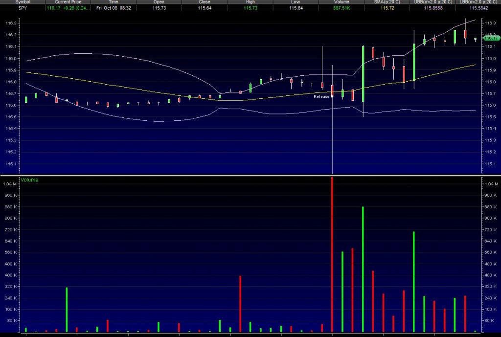
The chart says everything… Here’s my question: If Goldman thinks QE2=$1T is already priced in, what does this mean?  The probability of QE2 has gone to 1 or that $1T is not enough?

Edit: Of course, by the time I hit update, $SPY has sunk back below the 116.00 line.

Pricing the S&P 500 in terms of gold has been a hot topic lately (zh, BIG, to name a few).  I thought I’d contribute my own two cents on the issue, both by adding a month of intraday data and by considering how the correlation between the S&P 500 and gold have varied over this period.  For data, I’m using minutely bars from 09/13 to last night on the easily traded SPY and GLD (not front-month futures or the $SPX itself).

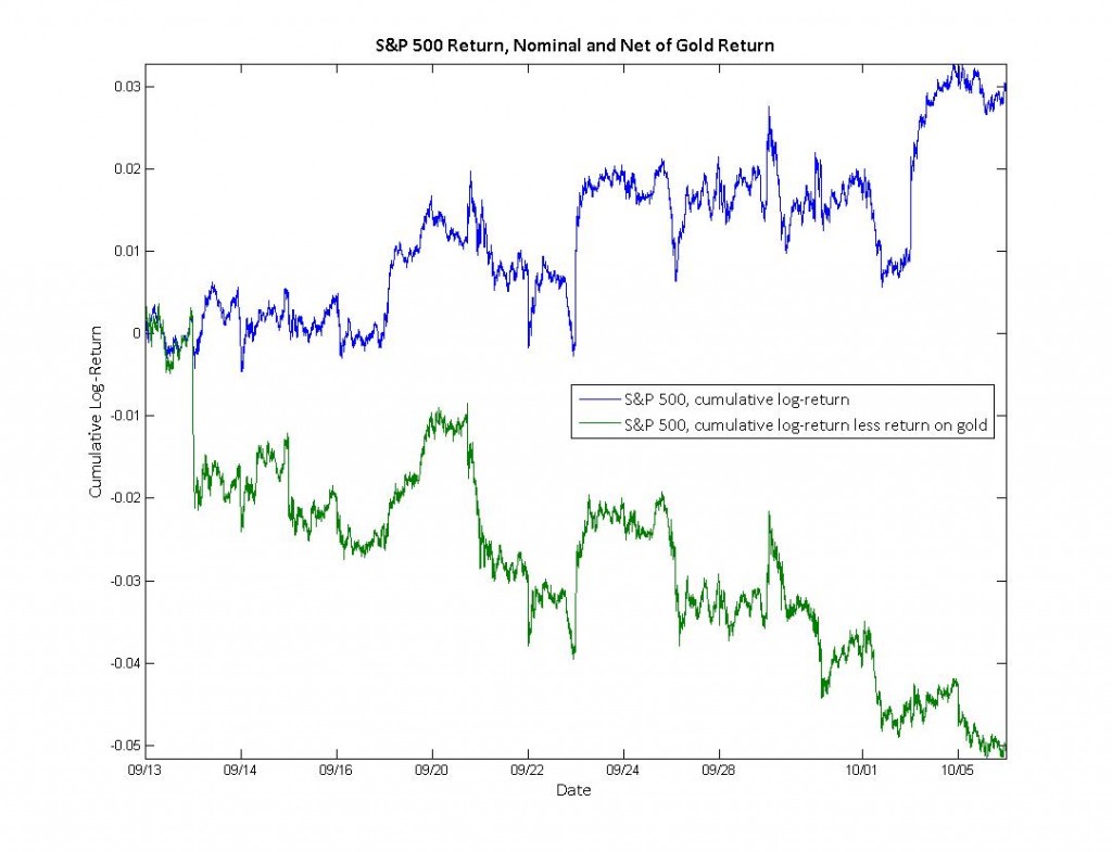
This first plot shows the cumulative log-return of the S&P 500 (SPY).  The blue line tracks the return of the S&P 500 itself, confirming 3% increase over this period that most media sources have focused on.  The green line, however, shows the return of the S&P 500 net of the return on gold.  This green line has fallen 5% over the same time period.


Many “gold bugs”  believe that gold is the appropriate numeraire for pricing since its value is not as subject to the monetary policy of governments.  While gold is certainly not a perfect proxy for purchasing power, it is likely more indicative of the purchasing-power-return than a simple dollar-return.  If we do take this logic at face value, then the real purchasing power of an S&P 500 portfolio has decreased, not increased.

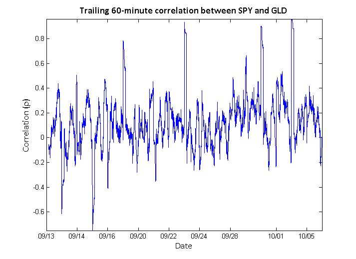
One might therefore ask whether the correlation between the S&P 500 and gold is decidedly positive or negative on short time-scales.  The figure below shows the trailing 60-minute correlation between SPY and GLD.

This figure indicates that the correlation seem to oscillate between mild positive and negative correlations.  On average, this correlation is mildly positive at 0.12  with a standard deviation of 0.22.

In conclusion, though the return of an S&P 500 portfolio denominated in gold has been negative over the past month, the short-term correlation between the S&P 500 and gold is neither strongly positive nor negative.

Much of my research focuses on the dynamic relationships between assets in the market (#1,#2,#3).  Typically, I use correlation as a measure of relationship dependence since its results are easy to communicate and understand (as opposed to mutual information, which is somewhat less used in finance than it is in information theory).  However, analyzing the dynamics of correlation require us to calculate a moving correlation (a.k.a. windowed, trailing, or rolling).

Moving averages are well-understood and easily calculated – they take into account one asset at a time and produce one value for each time period.  Moving correlations, unlike moving averages,  must take into account multiple assets and produce a matrix of values for each time period.  In the simplest case, we care about the correlation between two assets – for example, the S&P 500  (SPY) and the financial sector (XLF).  In this case, we need only pay attention to one value in the matrix.  However, if we were to add the energy sector (XLE), it becomes more difficult to efficiently calculate and represent these correlations.  This is always true for 3 or more different assets.

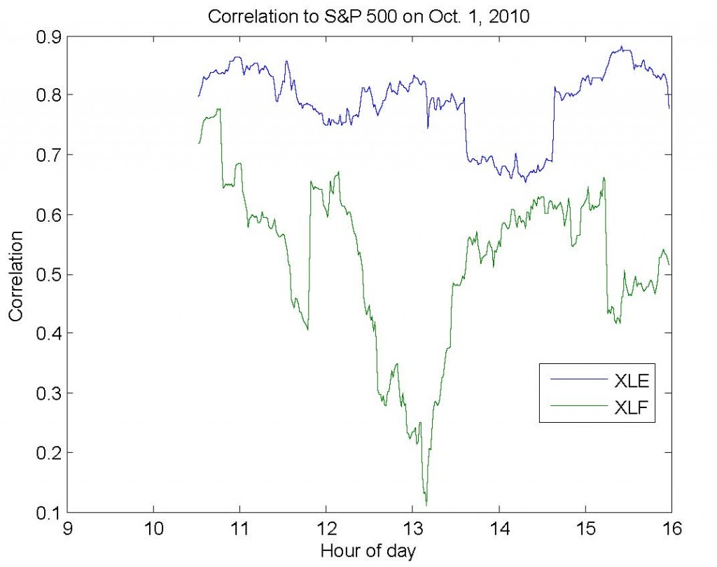
I’ve written the code below to simplify this process (download).  First, you provide a matrix (dataMatrix) with variables in the columns – for example, SPY in column 1, XLF in column 2, and XLE in column 3.  Second, you provide a window size (windowSize).  For example, if dataMatrix contained minutely returns, then a window size of 60 would produce trailing hourly correlation estimates.  Third, you indicate which column (indexColumn) you care about seeing the results for.  In our example, we would likely specify column 1, since this would allow us to observe the correlation between (1) the S&P and financial sector and (2) the S&P and energy sector.

The image below shows the results for exactly the example above for last Friday, October 1st, 2010.

I’ve just released a new revision of my working paper, Intraday Correlation Patterns Between the S&P 500 and Sector Indices, which you can download by clicking the link.  Here are a few of the improvements in the new revision:

  • I’ve updated the paper to include minutely data from August 23rd to October 1st.  This has effectively doubled the size of the dataset.  Furthermore, the sample now includes both up and down weeks.
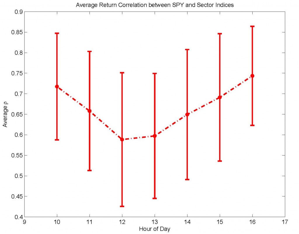
  • I’ve added two-sample K-S and Wilcoxon rank-sum tests to show more rigorously that the patterns observed in return and volume correlation are significant at the \alpha=0.001 level.
  • The paper now includes many more references to relevant existing literature.  If you think I’ve missed a paper that should be included, please let me know!

You can cite the paper in its current form as:

Bommarito, Michael James, Intraday Correlation Patterns between the S&P 500 and Sector Indices (September 16, 2010). Available at SSRN: http://ssrn.com/abstract=1677915

Kristina Peterson’s article in the WSJ last week on intraday patterns got me thinking and the result is this brief research paper.  There’s a significant amount of work I’d like to put into the paper, especially the preliminary analysis on volume correlation, but the results are interesting enough that I decided to publish a draft.  You can read the abstract below and download the paper here.

In this brief research note, I explore recent patterns in intraday return and volume correlation between the S\&P 500 and sector indices, as represented by minutely data from Aug. 23 to Sep. 10 for the SPDR exchange-traded funds. Notably, there appears to be evidence of two previously unreported patterns in intraday correlation. First, there is a “U-shaped” trend in return correlation, characterized by higher correlation at open and close and lower correlation during mid-day hours. Second, volume correlation is marked by lower values in the morning and increasing values in the afternoon. In some cases, this trend even takes the infamous “hockey-stick” shape, exhibiting stable values in the morning but sharply increasing values in the late afternoon. To ensure that these patterns are not a function of the choice of correlation window size, I confirm that these patterns are qualitatively stable over correlation windows ranging from 10 minutes to 90 minutes. These findings indicate that non-time-stationary patterns exist not only for volume and volatility, as previously reported, but also for the correlation of return and volume between the market and sector indices. These results have possible implications for intraday market efficiency and for trading strategies that rely on intraday time-stationarity of return or volume correlation.

Bommarito, Michael James, Intraday Correlation Patterns between the S&P 500 and Sector Indices (September 16, 2010). Available at SSRN: http://papers.ssrn.com/sol3/papers.cfm?abstract_id=1677915

Readers might be interested in an article that A. Duran and I have published  in Quantitative Finance this year entitled A Profitable Trading and Risk Management Strategy Despite Transaction Cost.  In the article, a number of the tools I’ve presented on the blog here have been used in the development of strategy which outperforms the S&P500 in rigorous out-of-sample testing.   We’ve made sure to check the robustness of the results, and have performed Monte Carlo simulations while varying the sets of stocks and time periods used in the calculation.   Here’s the abstract and a sample figure:

We present a new profitable trading and risk management strategy with transaction cost for an adaptive equally weighted portfolio. Moreover, we implement a rule-based expert system for the daily financial decision making process by using the power of spectral analysis. We use several key components such as principal component analysis, partitioning, memory in stock markets, percentile for relative standing, the first four normalized central moments, learning algorithm, switching among several investments positions consisting of short stock market, long stock market and money market with real risk-free rates. We find that it is possible to beat the proxy for equity market without short selling for S&P 500-listed 168 stocks during the 1998-2008 period and Russell 2000-listed 213 stocks during the 1995-2007 period. Our Monte Carlo simulation over both the various set of stocks and the interval of time confirms our findings.

You can download the paper either from SSRN or Quantitative Finance.


Please bear with me over the next few weeks while I copy old content and reproduce outdated research.  My goal is to focus on the research and content that drew most hits to the site – volatility, liquidity, and some technical topics in Matlab and Python.