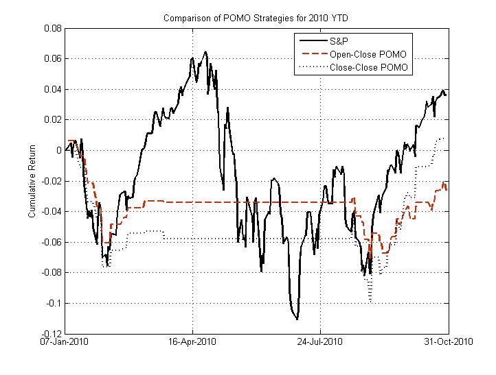
Since I’m sick of hearing ZeroHege purposefully misstating the empirical relationship between POMO and the equity market, I decided to put up this little figure below. This figure demonstrates the performance of the S&P 500 (SPY) in solid black compared to two POMO strategies in dashed black and red (close-close and open-close, respectively).
Note that only holding the market on POMO days has not returned more than the buy-and-hold S&P 500 strategy year-to-date. The S&P 500 has returned 3.62% YTD (close-close, not including dividend, which puts the buy-hold strategy even further ahead), whereas the open-close and close-close strategies have returned -2.63 and 0.79% respectively. These strategies do not even outperform the S&P 500 on a risk-adjusted basis (Sharpe). Furthermore, none of the regressions that were significant (p=0.05) in the 2005-2010 dataset are significant (p=0.1) in the 10 months through this year. In other words, though a relationship between the accepted-submitted proportion and return magnitude exists in the dataset as a whole, this relationship appears to have disappeared on the daily timescale. Sorry, Tyler(s).

Great analysis – and it was born out today. Hopefully your work will garner a wider audience.