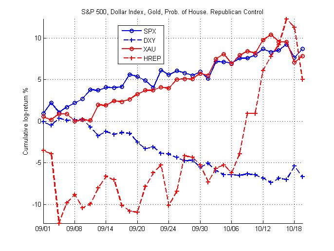
There's been a lot of talk lately about what factors might be driving the market.  The three factors I've seen suggested recently are the dollar, gold, and political expectations.  I thought I'd take a few moments to offer a very simple picture of the relationship since September.  The chart below shows the S&P 500 (SPX), the Dollar Index Futures (DXY), NYMEX Gold (XAU), and the InTrade probability that Republicans will control the House after the midterm.

I've taken two very simple approaches to assessing the relationships between these factors and the S&P 500.  They should be viewed as "approximations" at best.

The first approach is to calculate the correlation between the S&P 500 and these factors since September, both with and without a one-day lag.  

Without a lag, the correlation between the log-return of the S&P 500 and the dollar, gold, and political environment are -0.54, 0.37, and 0.17 respectively.  These coefficients can be interpreted as indicating that, within a given day, the S&P tends to move the opposite direction as the dollar and the same direction as gold and the probability of a Republican-controlled House.  Of these, the magnitude of the coefficient is largest on the dollar index, indicating that this relationship is likely strongest.

When we consider a lagged correlation between the S&P 500 and these factors, we obtain a different picture.  In this case, the correlation between the S&P 500's return tomorrow and today's return in the dollar, gold, and the probability of Republican House control are 0.55, -0.29, and -0.39 respectively.  These coefficients suggest the opposite of the within-day coefficients above, though the magnitude of the dollar correlation remains strongest.  This reverse relationship is likely due to the significant negative autocorrelation in the S&P 500 over the sample.

The second approach to assessing this relationship is to fit a GLM to the data to predict tomorrow's S&P 500 return from today's return in the factors.  In this case, I fit a simple normal model and obtain values of \beta of 0.79, 0.11, and -0.068 for the dollar index, gold, and probability of Republican-controlled House.  However, the t-statistic is only greater than 2 for the dollar index coefficient.

There are some measurement issues to address.  First, we're comparing the spot equity market to futures markets for gold and the dollar index.  Second, InTrade's probability of a Republican-controlled House is a very imperfect proxy for political environment. Not only does this probability ignore both the Senate and the Executive branch, but it also assumes that the House and Republican policy is capable of improving business climate.

However, taking this naive analysis at face value, it appears that the dollar does appear to be driving the S&P 500 more than gold or expectations of political environment.
One of my more arcane working papers recently hit a few top-ten lists on SSRN last week with a whopping 10 downloads.  The paper is focused on improving one of the key signals in my Quantitative Finance, A Profitable Trading and Risk Management Strategy Despite Transaction Cost.  You can get it here or read the abstract below:

We present an adjusted method for calculating the eigenvalues of a time-dependent return correlation matrix that produces a more stationary distribution of eigenvalues. First, we compare the normalized maximum eigenvalue time series of the market-adjusted return correlation matrix to that of logarithmic return correlation matrix on an 18-year dataset of 310 S&P 500-listed stocks for two (small and large) window or memory sizes. We observe that the resulting new eigenvalue time series is more stationary than time series obtained through the use of existing method for each memory. Later, we perform this analysis while sweeping the window size τ ε {5, ..., 100} in order to examine the dependence on the choice of window size. We find that the three dimensional distribution of the eigenvalue time series for our market-adjusted return is significantly more stationary than that produced by the classic method.

Bommarito, Michael James and Duran, Ahmet, Spectral Analysis of Time-Dependent Market-Adjusted Return Correlation Matrix (May 26, 2010). Available at SSRN: http://ssrn.com/abstract=1672897

Despite the recent decline in front and future VIX prices, many traders have recently taken speculative positions on increasing price ranges.  I decided to highlight the ten exchange-traded assets that had the widest weekly ranges as a proportion of Friday's closing price.  In addition to presenting just the range, I'm also providing the week's return, total dollar volume, and correlation to the S&P and gold.


Symbol Return Range Dollar Volume ($M) SPY Correlation GLD Correlation
TMF -11.1% 15.3% 28.461793 94.3% 66.0%
TYP -11.2% 15.1% 59.262521 -41.9% 55.7%
ZSL -10.5% 14.7% 64.935627 -5.7% -93.7%
SQQQ -10.6% 14.5% 163.841642 -39.0% 59.1%
CZM 7.9% 13.3% 25.011599 69.7% 91.9%
CZI -7.7% 13.2% 2.204423 -77.5% -82.7%
TMV 11.0% 13.2% 103.653646 -95.4% -63.2%
FAS -5.5% 12.8% 4001.066165 64.8% 28.1%
TYH 10.6% 12.7% 144.928741 43.9% -56.6%
TZA -4.4% 12.6% 2530.503744 -77.6% -87.2%


The results shouldn't be too surprising.  The pack is led by leveraged funds that track technology, Treasury, and commodities.  TYP, TYH, and SQQQ all correspond to triple-leverage Nasdaq or broad tech funds; of these, TYH and SQQQ were much more heavily traded this week.  Treasury funds hold their own as well, with the triple 20-year (TMF) and the triple short 30-year (TMV) showing large ranges this week.   ZSL is a double-leverage short silver fund, and CZM/CZI are triple-leveraged long/short China funds; much of the move in both Chinese and commodity markets this week was driven by the dollar.  Of all these funds, the triple-leverage financial ETF (FAS) clearly saw the most trading action, churning more than $4B this week.  With plenty of housing, job, and industrial data out next week, look for these funds to continue to expand on their recent price ranges.  

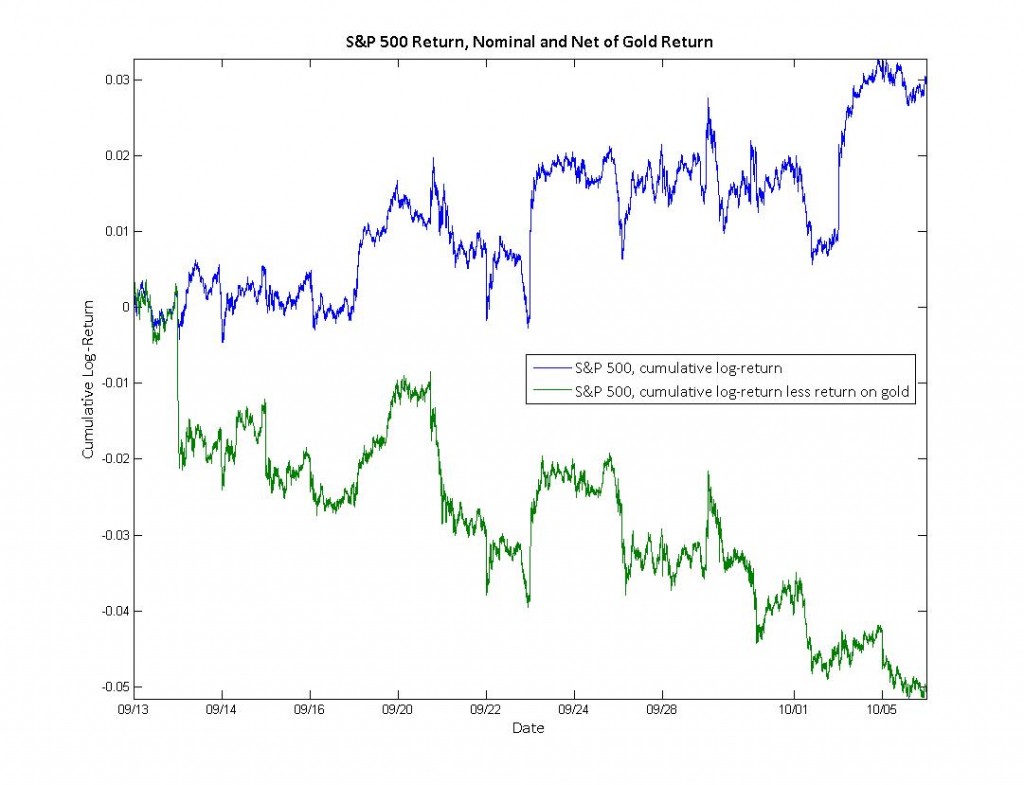
Pricing the S&P 500 in terms of gold has been a hot topic lately (zh, BIG, to name a few).  I thought I’d contribute my own two cents on the issue, both by adding a month of intraday data and by considering how the correlation between the S&P 500 and gold have varied over this period.  For data, I’m using minutely bars from 09/13 to last night on the easily traded SPY and GLD (not front-month futures or the $SPX itself).

This first plot shows the cumulative log-return of the S&P 500 (SPY).  The blue line tracks the return of the S&P 500 itself, confirming 3% increase over this period that most media sources have focused on.  The green line, however, shows the return of the S&P 500 net of the return on gold.  This green line has fallen 5% over the same time period.


Many “gold bugs”  believe that gold is the appropriate numeraire for pricing since its value is not as subject to the monetary policy of governments.  While gold is certainly not a perfect proxy for purchasing power, it is likely more indicative of the purchasing-power-return than a simple dollar-return.  If we do take this logic at face value, then the real purchasing power of an S&P 500 portfolio has decreased, not increased.

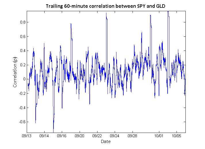
One might therefore ask whether the correlation between the S&P 500 and gold is decidedly positive or negative on short time-scales.  The figure below shows the trailing 60-minute correlation between SPY and GLD.

This figure indicates that the correlation seem to oscillate between mild positive and negative correlations.  On average, this correlation is mildly positive at 0.12  with a standard deviation of 0.22.

In conclusion, though the return of an S&P 500 portfolio denominated in gold has been negative over the past month, the short-term correlation between the S&P 500 and gold is neither strongly positive nor negative.

Much of my research focuses on the dynamic relationships between assets in the market (#1,#2,#3).  Typically, I use correlation as a measure of relationship dependence since its results are easy to communicate and understand (as opposed to mutual information, which is somewhat less used in finance than it is in information theory).  However, analyzing the dynamics of correlation require us to calculate a moving correlation (a.k.a. windowed, trailing, or rolling).

Moving averages are well-understood and easily calculated – they take into account one asset at a time and produce one value for each time period.  Moving correlations, unlike moving averages,  must take into account multiple assets and produce a matrix of values for each time period.  In the simplest case, we care about the correlation between two assets – for example, the S&P 500  (SPY) and the financial sector (XLF).  In this case, we need only pay attention to one value in the matrix.  However, if we were to add the energy sector (XLE), it becomes more difficult to efficiently calculate and represent these correlations.  This is always true for 3 or more different assets.

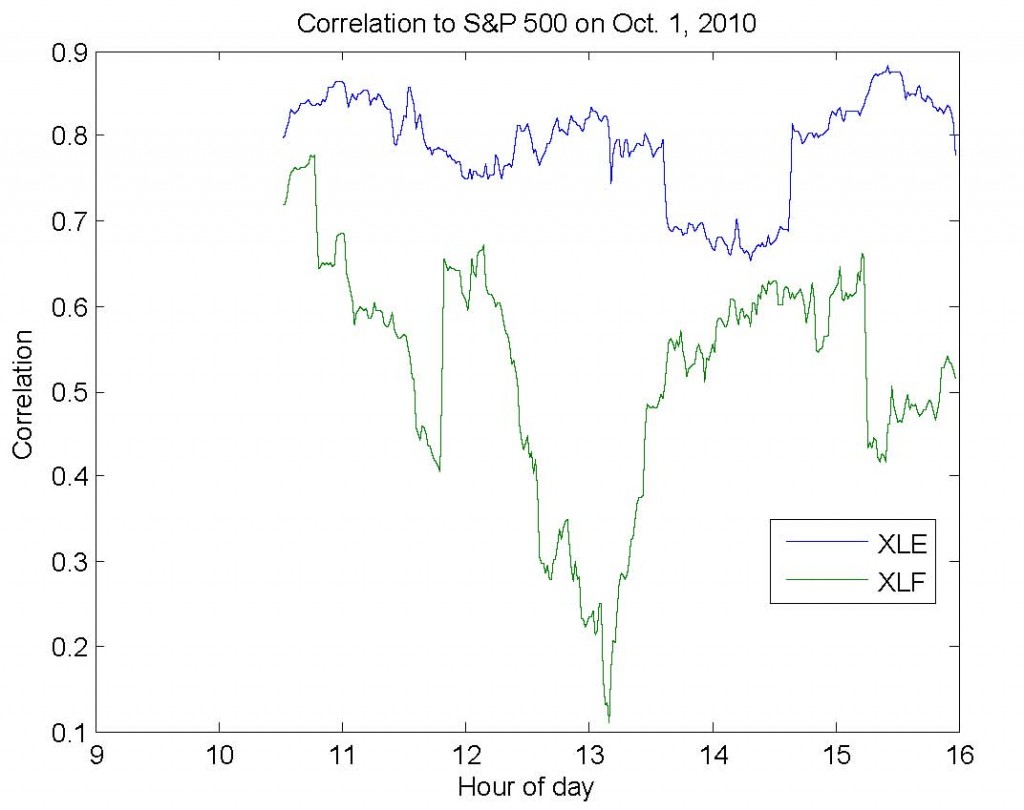
I’ve written the code below to simplify this process (download).  First, you provide a matrix (dataMatrix) with variables in the columns – for example, SPY in column 1, XLF in column 2, and XLE in column 3.  Second, you provide a window size (windowSize).  For example, if dataMatrix contained minutely returns, then a window size of 60 would produce trailing hourly correlation estimates.  Third, you indicate which column (indexColumn) you care about seeing the results for.  In our example, we would likely specify column 1, since this would allow us to observe the correlation between (1) the S&P and financial sector and (2) the S&P and energy sector.

The image below shows the results for exactly the example above for last Friday, October 1st, 2010.

I’ve just released a new revision of my working paper, Intraday Correlation Patterns Between the S&P 500 and Sector Indices, which you can download by clicking the link.  Here are a few of the improvements in the new revision:

  • I’ve updated the paper to include minutely data from August 23rd to October 1st.  This has effectively doubled the size of the dataset.  Furthermore, the sample now includes both up and down weeks.
  • I’ve added two-sample K-S and Wilcoxon rank-sum tests to show more rigorously that the patterns observed in return and volume correlation are significant at the \alpha=0.001 level.
  • The paper now includes many more references to relevant existing literature.  If you think I’ve missed a paper that should be included, please let me know!

You can cite the paper in its current form as:

Bommarito, Michael James, Intraday Correlation Patterns between the S&P 500 and Sector Indices (September 16, 2010). Available at SSRN: http://ssrn.com/abstract=1677915

Kristina Peterson’s article in the WSJ last week on intraday patterns got me thinking and the result is this brief research paper.  There’s a significant amount of work I’d like to put into the paper, especially the preliminary analysis on volume correlation, but the results are interesting enough that I decided to publish a draft.  You can read the abstract below and download the paper here.

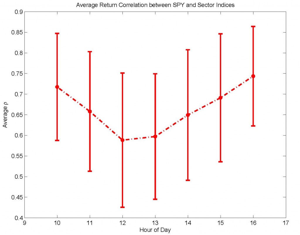
In this brief research note, I explore recent patterns in intraday return and volume correlation between the S\&P 500 and sector indices, as represented by minutely data from Aug. 23 to Sep. 10 for the SPDR exchange-traded funds. Notably, there appears to be evidence of two previously unreported patterns in intraday correlation. First, there is a “U-shaped” trend in return correlation, characterized by higher correlation at open and close and lower correlation during mid-day hours. Second, volume correlation is marked by lower values in the morning and increasing values in the afternoon. In some cases, this trend even takes the infamous “hockey-stick” shape, exhibiting stable values in the morning but sharply increasing values in the late afternoon. To ensure that these patterns are not a function of the choice of correlation window size, I confirm that these patterns are qualitatively stable over correlation windows ranging from 10 minutes to 90 minutes. These findings indicate that non-time-stationary patterns exist not only for volume and volatility, as previously reported, but also for the correlation of return and volume between the market and sector indices. These results have possible implications for intraday market efficiency and for trading strategies that rely on intraday time-stationarity of return or volume correlation.

Bommarito, Michael James, Intraday Correlation Patterns between the S&P 500 and Sector Indices (September 16, 2010). Available at SSRN: http://papers.ssrn.com/sol3/papers.cfm?abstract_id=1677915

This post was originally published on June 4th, 2007.  It has been slightly modified from a previous version of the site.

NB: The original market cap values were very wrong, thanks to order of magnitude errors in E*Trade’s data.  Thanks to Steven Towns for the corrections.

As I recently covered various fundamentals of broad and country-specific Asian ETFs for more aggressive portfolios, I was interested in summarizing a more conservative income sector like utilities.

Here is the data table, sorted by expense. Note that Cap is shown here in dollars, not thousands of dollars, and that Month Traded is shown in millions of dollars.

Symbol Expense Dividend Yield

Top 10 % Cap ($)

Month Traded ($M)
XLU 0.24% 0.11% 56.00% 3 M 2592
VPU 0.25% 2.51% 43.00% 393 K 34
JXI 0.48% 0.51% 42.00% 55 M 3
IDU 0.48% 2.29% 43.00% 980 M 72
RYU 0.50% 1.78% 25.00% 10 K 1
DBU 0.58% 0.11% 59.00% 26 M 2
PUW 0.60% 0.17% 29.00% 33 M 3
PRFU 0.60% 1.76% 38.00% 12 K 2
PUI 0.60% 1.60% 47.00% 57 K 3
PHO 0.60% 0.46% 35.00% 2 M 85
UTH 2.71% 76.00% 473 K 459
UTF 4.67% 1 M 44
GUT 7.24% 293 K 2
UTG 5.02% 596 K 11

It looks like there is no easy answer in this sector, but there are a number of advantages held by some funds.

  1. The Select SPDR XLU is by far the most dollar liquid utility ETF, followed by the Utility Holders UTH.  Investors looking to take very large positions that require stops should almost certainly pick one of these two funds.
  2. The largest fund is by far the iShares DJ Utility Index tracker IDU, followed by the S&P Global Utilities JXI and the PowerShares Progressive Energy PUW.
  3. PRFU, the FTSE RAFI Utility tracker, has quite a high expense ratio for just an index tracker in this sector.  It’s competitors at equivalent expense ratios are either actively managed or hold more uncommon assets like water or progressive energy.
  4. VPU and IDU have the best Yield minus Expense for those looking for income in their holdings.
  5. Of the index funds, the Rydex equal-weight seems to have the best diversification at its given expense cost, having only 25% of its holdings in its 10 ten assets (since it is equal-weighted).  As equal-weight funds become more popular, it’ll be interesting to see how they perform in more bearish markets.