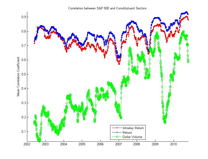
What does the trailing monthly correlation between the S&P 500 (SPY) and its constituent sectors (SPDR sector ETFs) look like over the past few years? The figure below shows this moving correlation for the intraday return (log close/open), regular return (log adjusted close), and total dollar volume (using open/close midpoint).  It looks like we’re sitting just under the high set last week.  I’ll let you decide how you think this factors into the ongoing discussion on correlation, but correlation periodicity may be more of an intraday than monthly thing.

P.S. This uses the Matlab code I posted for calculating moving correlations here.

In the next day or two, I’m hoping to produce some comprehensive research (at least comparatively in the blogosphere) on the relationship between the S&P 500 and the Federal Reserve’s permanent open market operations. Historical data for these operations is available back to August 2005.

In order to do this, I needed to get the Fed’s POMO data into a much more reasonable format.  The spreadsheet below is the result of my work.  You can download the spreadsheet here.

As an added bonus, I’ve decided to release the Python code I used to process the NYFRB’s XML data (you’ll need lxml, too). Here it is below:

Here’s another new paper on q-FIN that I thought might be worth mentioning.  Having skimmed it, I have a few questions.  First, if the paper’s title includes the phrase “different time-scales,” you should include more than 15-minute interval sampling.  I’d like to see whether their conclusions are robust on two-minute or 60-minute intervals as well (like this).  Second, there is a large body of literature on the leading eigenvalues of the correlation matrix.  This path of inquiry is twenty years old and has already produced a number of the conclusions that are in the paper.  I guess I’m curious as to why they chose to use sum-of-signs instead of something like the proportion of the leading eigenvalue to the sum of eigenvalues (it works well here).   Anyway, even if there are some methodological issues, the paper’s conclusions are interesting and it’s always nice to see fresh work on intra-day dynamics and market “panic.”

Cross-sectional signatures of market panic were recently discussed on daily time scales in [1], extended here to a study of cross-sectional properties of stocks on intra-day time scales. We confirm specific intra-day patterns of dispersion and kurtosis, and find that the correlation across stocks increases in times of panic yielding a bimodal distribution for the sum of signs of returns. We also find that there is memory in correlations, decaying as a power law with exponent 0.05. During the Flash-Crash of May 6 2010, we find a drastic increase in dispersion in conjunction with increased correlations. However, the kurtosis decreases only slightly in contrast to findings on daily time-scales where kurtosis drops drastically in times of panic. Our study indicates that this difference in behavior is result of the origin of the panic-inducing volatility shock: the more correlated across stocks the shock is, the more the kurtosis will decrease; the more idiosyncratic the shock, the lesser this effect and kurtosis is positively correlated with dispersion. We also find that there is a leverage effect for correlations: negative returns tend to precede an increase in correlations. A stock price feed-back model with skew in conjunction with a correlation dynamics that follows market volatility explains our observations nicely.

L. Borland, Y. Hassid. Market panic on different time-scales. arXiv:1010.4917

Here’s a nasty looking headline from FT’s 6am cut this morning (which is now paywalled, btw)  - European bank bail-ins will cost +87 basis points.  The article summarizes the results of a JP Morgan survey on the effect of various “bail-in” options.  Here’s JPM’s summary:

Survey responses indicated that the implementation of bail-in frameworks is likely to have a material impact on the pricing of senior debt. Firstly, respondents indicated that the greater loss outcomes associated with bail-in regimes are not being priced in, despite the existence of special resolution regimes which already may imply similar loss outcomes for senior bondholders. Secondly, the average risk premium that investors would demand for a single ‘A’ bank under a bail-in regime would be 87bp. Thirdly, investors clearly expect that the implementation of a bail-in framework will lead to an increase in price differentials across issuers of differing credit quality. In our opinion, the sum total of the implementation bail-in regimes together with the current extensive regulatory capital reform process could be a major driver of M&A activity amongst the European banking sector, as smaller and lower ratings issuers may struggle to access capital markets at levels which allows their business models to remain intact.

Yikes.

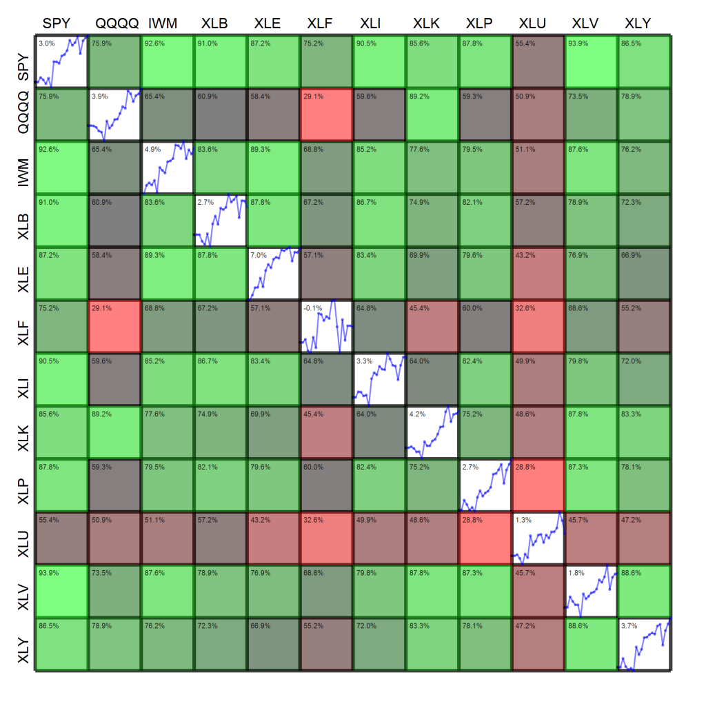
Heatmaps have been all the rage this week. I was driving down US-23 to Ann Arbor last Monday and heard Jim Cramer introduce the thing to Erin Burnett.  My first instinct was that we’d see something like this, followed by a rant from Mark Haines.  However, the real thing turned out to be much more tame and reasonable.

Now that heatmaps are en vogue, I figured I’d take my own shot at one.  I’ve always been a fan and use them in publications, but there’s a very fine line between conveying large amounts of information intuitively and just overloading the viewer.  The figure below shows two pieces of information simultaneously:

  1. The diagonal cells show the cumulative log-return time series of each asset over the past month.  The upper left hand corner of the diagonal cell displays the past month’s return.
  2. Off-diagonal cells show the color-coded correlation between assets.  For example, reading across the first row shows the correlation of each asset with the S&P 500.  Reading the figure indicates that the S&P 500 (SPY) has a correlation coefficient of 75.9% with the Nasdaq (QQQQ) and 92.6% with the Russell 2000 (IWM).  The upper left hand corner of these off-diagonal cells displays the correlation coefficient.

Please let me know what you think of the figure, pro or con.  If you’ve got any other suggestions, also feel free to leave a comment.  Note that there are a still a few “degrees of visualization freedom,” e.g., thickness of cell borders, opacity of cells, plenty of free pixels in the interior of cells.   For instance, how would you suggest I convey information about the volatility of each fund over the week?

For anyone interested in the legal background on MERS, the Mortgage Electronic Registration System, I strongly recommend this very accessible law review by Christopher Peterson.  There are two take-aways that I will emphasize.  First, a substantial body of case law stands behind the principle that  ”[a] note and mortgage are inseparable…, the assignment of the note carries with it the mortgage, while an assignment of the latter alone is a nullity” (id, pg. 7).  Second, municipalities may have ground to claim reimbursement for unpaid mortgage assignments over the past 15 years.  These unpaid county recorder fees may also constitute tax fraud, and penalties and interest may therefore apply to the total amounts.

Below is the abstract and citation:

Hundreds of thousands of home foreclosure lawsuits have focused judicial scrutiny on the Mortgage Electronic Registration System (“MERS”). This Article updates and expands upon an earlier piece by exploring the implications of state Supreme Court decisions holding that MERS is not a mortgagee in security agreements that list it as such. In particular this Article looks at: (1) the consequences on land title records of recording mortgages in the name of a purported mortgagee that is not actually mortgagee as a matter of law; (2) whether a security agreement that fails to name an actual mortgagee can successfully convey a property interest; and (3) whether county governments may be entitled to reimbursement of recording fees avoided through the use of false statements associated with the MERS system. This Article concludes with a discussion of steps needed to rebuild trustworthy real property ownership records.

Peterson, Christopher Lewis, Two Faces: Demystifying the Mortgage Electronic Registration System’s Land Title Theory (September 19, 2010). Real Property, Probate and Trust Law Journal, Forthcoming. Available at SSRN.

Though the article does take a normative (rather than objective) stance on some points, the article text provides an excellent summary of issues with MERS and its footnotes list many additional sources of information.

Another week in the black for the market, though only barely for most indices. The list of big movers this week is an interesting one.

In the green, we have exchange-traded funds for cotton (BAL), 2x inverse Brazil (BZQ), coffee (JO), 3x real estate (DRN), and 2x inverse silver (ZSL).  Interestingly, cotton, Brazil, coffee, and silver are all commodity or export-based assets that are strongly affected by the dollar.  However, the direction of their movement varied (remember, ZSL is inverse silver).

The red side of the table features 3x inverse real estate (DRV), 2x BRICs (BRIL), 2x Brazil (UBR), natural gas (GAZ), and short-term VIX (VXX).  DRV, BRIL, and UBR all correspond to funds on the green side of the table.  However, the natural gas ETF (GAZ) and VIX ETF (VXX) do not have corresponding products in the green.

VXX especially has been labeled a “bad” product (see agwarner’s latest in his ongoing crusade against VXX).  I would tend to agree with Adam, as a number of VXX calls I recently held expired OTM despite what would have been a profitable trade on the underlying futures.

Symbol Return $ Volume
BAL 9.7% 15M
BZQ 9.4% 12M
JO 6.3% 7M
DRN 6.3% 284M
ZSL 6.3% 86M
DRV -7.5% 140M
BRIL -7.6% 1M
UBR -10.3% 4M
GAZ -11.2% 7M
VXX -12.7% 2.6B

Since we’re in for a few weeks driven by domestic data and possible market exogeneities (e.g., G-20, France, U.S. politics), look for these ETFs to continue their dramatic moves.
Around a year ago, Dan and I put up an animation of the major foreign holders of Treasury securities from 2002 to 2009 at my other blog, Computational Legal Studies.  At the time, the conversation was driven by China surpassing Japan as the largest foreign holder.

Since then, there’s been quite a bit of speculation as to when the Federal Reserve would surpass these largest foreign holders.  The Fed has been acquiring these securities through its various Open Market Operations (OMO).  However, I think focusing on just this Fed-vs.-China benchmark may be a bit misleading.

The animation below shows the proportion of Treasury securities held by the Federal Reserve, Japan, China, and all other foreign holders of Treasury securities between 2004 and 2010.  The Federal Reserve holdings are based on the second column of the Fed’s latest H.4.1 and are current up to October 21st.  The Treasury’s TIC data (historical here) is significantly lagged, however, and only current as of the end of August.  Therefore, I’ve held the values constant from August for foreign holders, though the Fed’s slice does change based on real data.

I’ll let the video mostly speak for itself, but note that the increase in the Fed’s holdings are relatively dwarfed by the increase in total foreign holdings.

N.B.: It’s HD, make sure the watch the video in fullscreen!

Holders of Treasury Securities, 2004-2010 from Computational Legal Studies on Vimeo.