Here’s a paper out of the CabDyn group at Oxford from D. Fenn and M. Porter. Mason is also one of the leading researchers in network science, and their group has entered into a number of joint Ph.D./post-doctoral hires with the business school there. The result is a large number of interesting papers.  This particular paper investigates correlation matrices through RMT, which is exactly what my Quantitative Finance paper and recent working paper address.  Though they don’t examine their calculations in an applied context, the results provide additional view into recent correlation dynamics.  Abstract and download below:

Abstract: We investigate financial market correlations using random matrix theory and principal component analysis. We use random matrix theory to demonstrate that correlation matrices of asset price changes contain structure that is incompatible with uncorrelated random price changes. We then identify the principal components of these correlation matrices and demonstrate that a small number of components accounts for a large proportion of the variability of the markets that we consider. We then characterize the time-evolving relationships between the different assets by investigating the correlations between the asset price time series and principal components. Using this approach, we uncover notable changes that occurred in financial markets and identify the assets that were significantly affected by these changes. We show in particular that there was an increase in the strength of the relationships between several different markets following the 2007–2008 credit and liquidity crisis.

D. J. Fenn, M. A. Porter, S. Williams, M. McDonald, N. F. Johnson, N. S. Jones. Temporal Evolution of Financial Market Correlations. http://arxiv.org/abs/1011.3225.
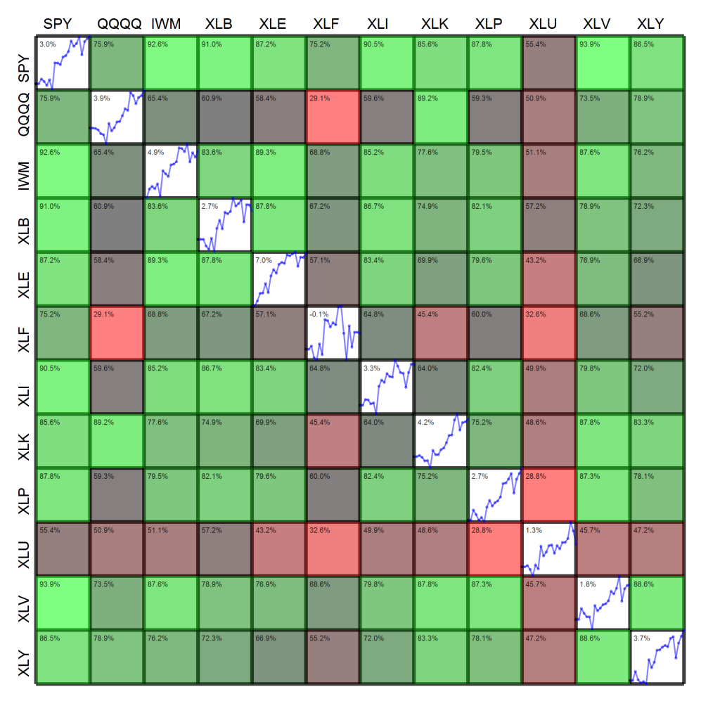
Last week, I posted a zoomable visualization of the weekly market and sector performance and correlation.  People seem to find this image both useful and “cool,” so here is this week’s edition and takeaways below:

  • Green, green, green (on the diagonal).  Other than healthcare  (XLV), every sector was up at least 1%, and most were up well over 3%.
  • More green (off the diagonal).  Most sectors were strongly correlated with one another, with the exception of financials (XLF) and healthcare (XLV).  Healthcare, as noted above, underperformed the market significantly by 2.5%.  The story with financials is the opposite – financials were up a whopping 6.8% this week, putting them over 3% ahead of the market.
  • Correlation was strongest between energy (XLE) and materials (XLB) at 99.5% and weakest between financials (XLF) and healthcare (XLV) at -21.8%.


By the way, this figure is produced with Python and cairo.  The code is fairly ugly and long, so I probably won’t release it unless there’s some demand.

Another one fresh off the pre-printing press at arXiv. Having skimmed the paper, this looks like a serious treatment of a very serious problem – reconstructing the coefficient on the correlation term of models when returns are sampled asynchronously, as is almost always the case when using tick data.  On a related note, Section 2 is the best presentation of the Epps effect in this context I’ve seen.

Abstract: A detailed analysis of correlation between stock returns at high frequency is compared with simple models of random walks. We focus in particular on the dependence of correlations on time scales – the so-called Epps e ect. This provides a characterization of stochastic models of stock price returns which is appropriate at very high frequency.

I. Mastromatteo, M. Marsili, P. Zoi. Financial correlations at ultra-high frequency: theoretical models and empirical estimation. arXiv:1011.1011

What would happen if you took the Index and Sector Summary Heatmap I made last week, blew it up to the size of a 36MP image (6000-by-6000), and then added a plot of the change in correlation over time. Great question! Look below.

Since there’s a lot going on here, let’s summarize what’s going on:

  • Make sure you zoom into the figure!  You can use the scroll wheel on your mouse or two-finger slide on your touchpad to quickly zoom in and out.
  • Each diagonal cell shows the return of each asset over the past week (6 periods, 5 returns). As an asset increases, the line is colored green, and as an asset decreases, the line is colored red.
  • The lower left hand corner of each diagonal cell  shows the total return of the asset over the past week.  There’s also a label down there, in case you’re zoomed in and can’t see the labels on the edge.
  • The off-diagonal cells show the correlation (5-period return) between two assets.  The color of the cell indicates the degree of correlation – more correlated assets are more green, and less correlated assets are more red.  In case you’re zoomed in, there’s a label in the lower left hand corner that tells you which two assets you’re looking at.
  • The off-diagonal cells also show the time series of 5-day return correlation over the past 4 weeks.

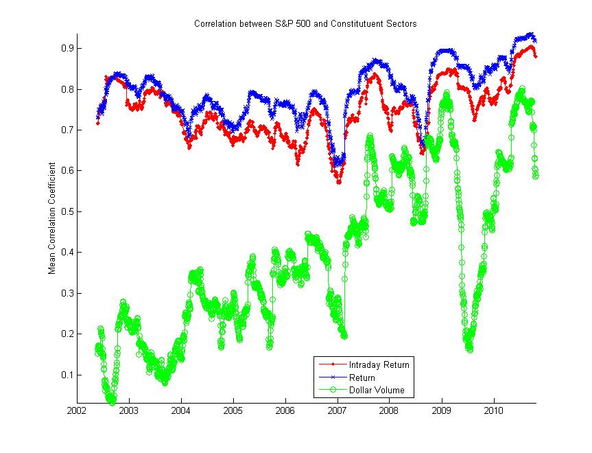
What does the trailing monthly correlation between the S&P 500 (SPY) and its constituent sectors (SPDR sector ETFs) look like over the past few years? The figure below shows this moving correlation for the intraday return (log close/open), regular return (log adjusted close), and total dollar volume (using open/close midpoint).  It looks like we’re sitting just under the high set last week.  I’ll let you decide how you think this factors into the ongoing discussion on correlation, but correlation periodicity may be more of an intraday than monthly thing.

P.S. This uses the Matlab code I posted for calculating moving correlations here.

Here’s another new paper on q-FIN that I thought might be worth mentioning.  Having skimmed it, I have a few questions.  First, if the paper’s title includes the phrase “different time-scales,” you should include more than 15-minute interval sampling.  I’d like to see whether their conclusions are robust on two-minute or 60-minute intervals as well (like this).  Second, there is a large body of literature on the leading eigenvalues of the correlation matrix.  This path of inquiry is twenty years old and has already produced a number of the conclusions that are in the paper.  I guess I’m curious as to why they chose to use sum-of-signs instead of something like the proportion of the leading eigenvalue to the sum of eigenvalues (it works well here).   Anyway, even if there are some methodological issues, the paper’s conclusions are interesting and it’s always nice to see fresh work on intra-day dynamics and market “panic.”

Cross-sectional signatures of market panic were recently discussed on daily time scales in [1], extended here to a study of cross-sectional properties of stocks on intra-day time scales. We confirm specific intra-day patterns of dispersion and kurtosis, and find that the correlation across stocks increases in times of panic yielding a bimodal distribution for the sum of signs of returns. We also find that there is memory in correlations, decaying as a power law with exponent 0.05. During the Flash-Crash of May 6 2010, we find a drastic increase in dispersion in conjunction with increased correlations. However, the kurtosis decreases only slightly in contrast to findings on daily time-scales where kurtosis drops drastically in times of panic. Our study indicates that this difference in behavior is result of the origin of the panic-inducing volatility shock: the more correlated across stocks the shock is, the more the kurtosis will decrease; the more idiosyncratic the shock, the lesser this effect and kurtosis is positively correlated with dispersion. We also find that there is a leverage effect for correlations: negative returns tend to precede an increase in correlations. A stock price feed-back model with skew in conjunction with a correlation dynamics that follows market volatility explains our observations nicely.

L. Borland, Y. Hassid. Market panic on different time-scales. arXiv:1010.4917

Heatmaps have been all the rage this week. I was driving down US-23 to Ann Arbor last Monday and heard Jim Cramer introduce the thing to Erin Burnett.  My first instinct was that we’d see something like this, followed by a rant from Mark Haines.  However, the real thing turned out to be much more tame and reasonable.

Now that heatmaps are en vogue, I figured I’d take my own shot at one.  I’ve always been a fan and use them in publications, but there’s a very fine line between conveying large amounts of information intuitively and just overloading the viewer.  The figure below shows two pieces of information simultaneously:

  1. The diagonal cells show the cumulative log-return time series of each asset over the past month.  The upper left hand corner of the diagonal cell displays the past month’s return.
  2. Off-diagonal cells show the color-coded correlation between assets.  For example, reading across the first row shows the correlation of each asset with the S&P 500.  Reading the figure indicates that the S&P 500 (SPY) has a correlation coefficient of 75.9% with the Nasdaq (QQQQ) and 92.6% with the Russell 2000 (IWM).  The upper left hand corner of these off-diagonal cells displays the correlation coefficient.

Please let me know what you think of the figure, pro or con.  If you’ve got any other suggestions, also feel free to leave a comment.  Note that there are a still a few “degrees of visualization freedom,” e.g., thickness of cell borders, opacity of cells, plenty of free pixels in the interior of cells.   For instance, how would you suggest I convey information about the volatility of each fund over the week?

Here’s the beginning of an FT Alphaville article from this morning:

Whilst much has been written about the rise in correlation recently — what’s been less frequently observed is the strange disconnection that’s occurring between correlation and volatility.

The two traditionally move together. That is, correlation tends to rise and fall with volatility.

Yet as FT Alphaville discovered — whilst working on a special report on the subject of how increasing correlation is impacting banks’ structured products desks — what’s really puzzling at the moment is why correlation is refusing to budge lower as volatility has fallen.

Read the rest here – `Something exceptional’ is happening in volatility, correlation