I received an email from Quantitative Finance informing me that my paper with A. Duran,
A Profitable Trading and Risk Management Strategy Despite Transaction Cost, will be freely available online in a “virtual issue” of the journal on risk. This issue is designed to coincide with the RiskMinds 2010 conference currently taking place. Please access the published version of my paper from InformaWorld here or the entire Risk issue here through the end of the month.
Abstract: We introduce a multivariate GARCH-Copula model to describe joint dynamics of overnight and daytime returns for multiple assets. The conditional mean and variance of individual overnight and daytime returns depend on their previous realizations through a variant of GARCH specification, and two Student’s t copulas describe joint distributions of both returns respectively. We employ both constant and time-varying correlation matrices for the copulas and with the time-varying case the dependence structure of both returns depends on their previous dependence structures through a DCC specification. We estimate the model by a two-step procedure, where marginal distributions are estimated in the first step and copulas in the second. We apply our model to overnight and daytime returns of SPDR ETFs of nine major sectors and briefly illustrate its use in risk management and asset allocation. Our empirical results show higher mean, lower variance, fatter tails and lower correlations for overnight returns than daytime returns. Daytime returns are significantly negatively correlated with previous overnight returns. Moreover, daytime returns depend on previous overnight returns in both conditional variance and correlation matrix (through a DCC specification). Most of our empirical findings are consistent with the asymmetric information argument in the market microstructure literature. With respect to econometric modelling, our results show a DCC specification for correlation matrices of t copulas significantly improves the fit of data and enables the model to account for time-varying dependence structure.
L. Kang, S. Babbs. Modelling Overnight and Daytime Returns Using a Multivariate Garch-Copula Model. http://ssrn.com/abstract=1710799.
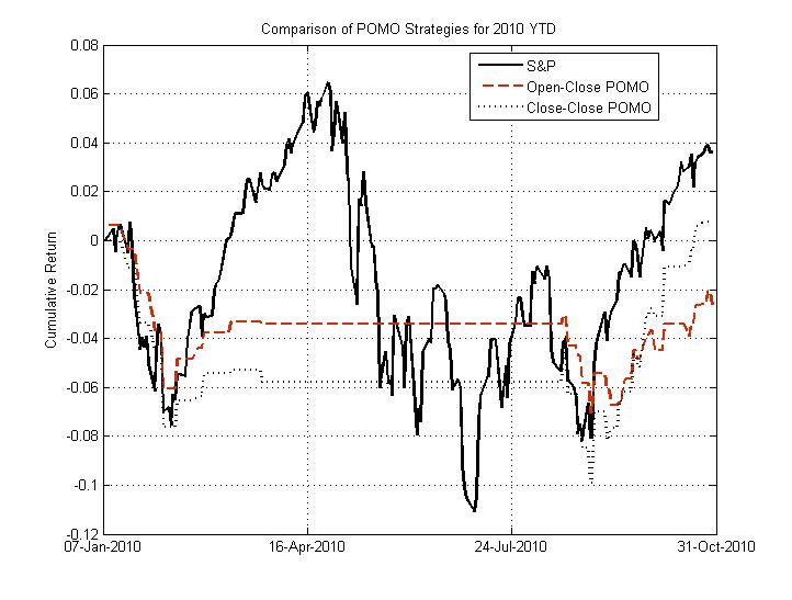
Since I’m sick of hearing ZeroHege purposefully misstating the empirical relationship between POMO and the equity market, I decided to put up this little figure below. This figure demonstrates the performance of the S&P 500 (SPY) in solid black compared to two POMO strategies in dashed black and red (close-close and open-close, respectively).
Note that only holding the market on POMO days has not returned more than the buy-and-hold S&P 500 strategy year-to-date. The S&P 500 has returned 3.62% YTD (close-close, not including dividend, which puts the buy-hold strategy even further ahead), whereas the open-close and close-close strategies have returned -2.63 and 0.79% respectively. These strategies do not even outperform the S&P 500 on a risk-adjusted basis (Sharpe). Furthermore, none of the regressions that were significant (p=0.05) in the 2005-2010 dataset are significant (p=0.1) in the 10 months through this year. In other words, though a relationship between the accepted-submitted proportion and return magnitude exists in the dataset as a whole, this relationship appears to have disappeared on the daily timescale. Sorry, Tyler(s).
It seems like many of my posts lately have been critical of others lately (#1: POMO, #2: Dollar / Gold, #3: Twitter ). On the downside, everybody wants to get along and nobody makes friends on the attack. On the upside, it’s good for plenty of site hits and provides two sides to a discussion.
So what the hell, here it goes – here’s why I think the ZeroHedge submitted/accepted ratio post gets it wrong. (Note that all of the analysis, both here and by John Lohman, suffers from an in-sample issue. None of this is really a strategy that could be implemented without information about the submitted-to-accepted ratio in advance. This may still be profitable if you took the positions at 11am instead of 9:30am, but none of the data we’re providing proves it. I will be performing real intraday analysis with out-of-sample backtesting in the paper I’m working on right now).
First of all, I think John Lohman’s logic is mostly right in the hypothesis. If the “conspiracy theory” is really true, then the ratio of submitted-to-accepted should be proportional to the market’s return. However, there are a few points I’d like to make for rigor’s sake here.
- First, why can’t PDs go short too? Maybe it makes more sense to put the absolute value of the market’s return on the LHS, dropping the sign. (Hint: See below if you want the answer!)
- Second, there are a number of alternate hypotheses that are not conspiracy-like that could also result in this proportional relationship. Maybe market participants just take some days of the week off, and the Fed chose to schedule POMO on days that would have higher liquidity anyway. If you were Brian Sack, wouldn’t you want to schedule these operations on days where the most PDs would participate or they would be best staffed?
- Third, just to emphasize it again, neither John nor I are actually presenting these analyses as something you can take to the market. The submitted-accepted ratio comes out after the operation begins, which is never before 9:30am, which means you could never realize the returns we’re showing precisely. For a strategy you can actually execute, see yesterday’s post (but don’t assume it’s profitably stable).
- Fourth, I’ve switched from submitted-to-accepted to accepted-to-submitted. This makes everything easier to see and interpret.
OK, so again, John’s logic is decent enough. If I had to guess, Tyler at ZH likely added his own emphasis to the post “for effect,” which might have masked some of John’s real tone. So down to the brass tacks and the data. First of all, I’m using the SPY for the S&P 500 and my POMO dataset for information on the submitted-to-accepted ratio. I’m also publishing the Matlab code here, just for full disclosure sake.
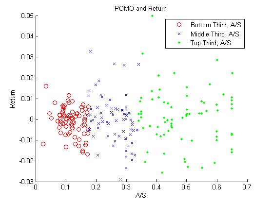
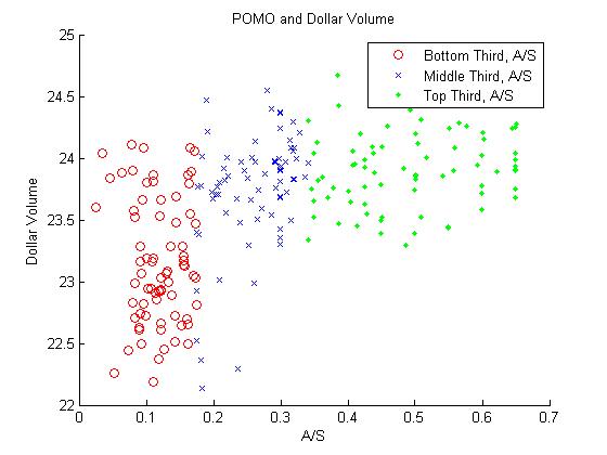
Now, if you run this code, you’ll see the following two scatter plots pop up. The red are the bottom third of the POMO operations by accepted-to-submitted ratio, the blue are the middle third, and the green are the top third.
OK, so it looks like there’s definitely something going on for the dollar volume. However, the story for the return is a little bit more fuzzy. It appears that the spread increases as the accepted-to-submitted ratio increases, but not necessarily that there is a strong direction to the sign. Maybe, as I mentioned above, the magnitude of the return is what’s proportional, not just the value. As you can see in the Matlab code, I fit a simple GLM for each of these and get the following:
- log(close) – log(open) ~ accepted/submitted ratio: The coefficient on the ratio is slightly positive (0.0066, +-0.0047) but the t-stat is 1.4. No go.
- log(dollar volume) ~ accepted/submitted ratio: The coefficient is on the ratio is definitely positive (1.75, +-0.18) and the t-stat is 9.6. This conclusion is definitely supported – the ratio of accepted-to-submitted is proportional to the total dollars traded on SPY.
- abs(log(close) – log(open)) ~ accepted/submitted ratio: In this case, the coefficient is definitely positive (0.0159, +-0.0032) and the t-stat 5.0. This conclusion is also supported – the ratio of accepted-to-submitted is proportional to the magnitude of SPY’s return, but not necessarily the direction.
So there you have it – the dollar volume and magnitude of the change are statistically significantly related to the POMO accepted-to-submitted ratio, but the direction is not really guaranteed. Much more of this to come in a research paper I’m currently working on.
I noticed that there’s been some analysis of the performance of the market on days with and without POMO from Pragmatic Capitalism. I’ve been running some preliminary calculations for a short research paper on the topic and noticed that my numbers didn’t match up. I’ve decided to publish some of these results.
First of all, I’m using the dataset that I published yesterday on all Permanent Open Market Operations. There have now been 230 POMO operations, including both Treasury and agency transactions and purchases and sales. I’m also using the performance of SPY from August 2005 to October 25th, 2010.
Furthermore, my numbers diverge from the Pragmatic Capitalism on returns. Returns are a bit of a fuzzy concept, however, so I’ve tried quite a few options.
Option 1: Log(close) – Log(open) on the day of POMO. In this case, POMO returns 13.9% with a daily std. dev. of 1.18%, whereas no POMO returns -34.7% and a daily std. dev. of 1.26%. 52.68% of POMO intraday returns are positive, whereas 51.49% of no POMO returns are positive.
Option 2: Log(tomorrow close) – Log(close). In other words, buy at the end of a POMO day and market-on-close tomorrow. In this case, POMO returns 8.30% with a daily std. dev. of 1.46%, whereas no POMO returns -11.4% with a daily std. dev. of 1.56%.
Option 3: Log(close) – Log(yesterday close). This means buy market-on-close the day before POMO and sell market-on-close the day of POMO. This strategy returns 29.5% with a daily std. dev. of 0.57%. The alternative returns -32.7% with a daily std. dev. of 1.44%. Clearly frontrunning POMO on SPY is profitable, but we should all be clear about what we’re calculating when we talk about strategies here.
N.B.: As I mentioned, this will be part of a short research paper in the next week or so. I’ll address whether or not these returns are stable, especially in the past few weeks, in the paper.
Update: Johan wrote me back this afternoon and confirmed that the z-scores are not used in assessing predictive power. I think future drafts of the paper will be much more clear on this point, as apparently similar concerns had been raised by others. Based on Johan's statements, I'd like to emphasize that this paper does rigorously support the claim that Twitter can be used to help predict the direction of the Dow for their sample. Though directional prediction does not necessarily equate to profitable strategy, this is an exciting conclusion. I think the paper would benefit most from a portfolio backtesting instead of just directional prediction, and perhaps an extensions to either interest rates or the something like the VIX. All in all, I'm excited to see future research from their group.
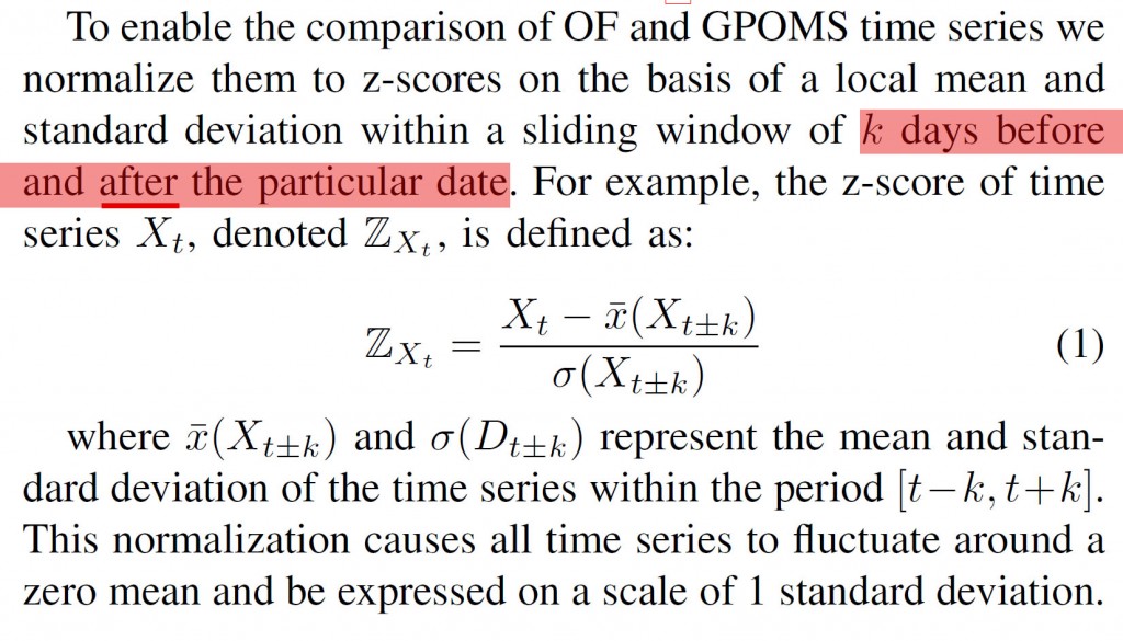
As I noted when I first linked to this paper on arXiv, I think there may be an issue with the claim of prediction. Here is the portion of text that raises some serious questions in my mind. Emphasis is mine.
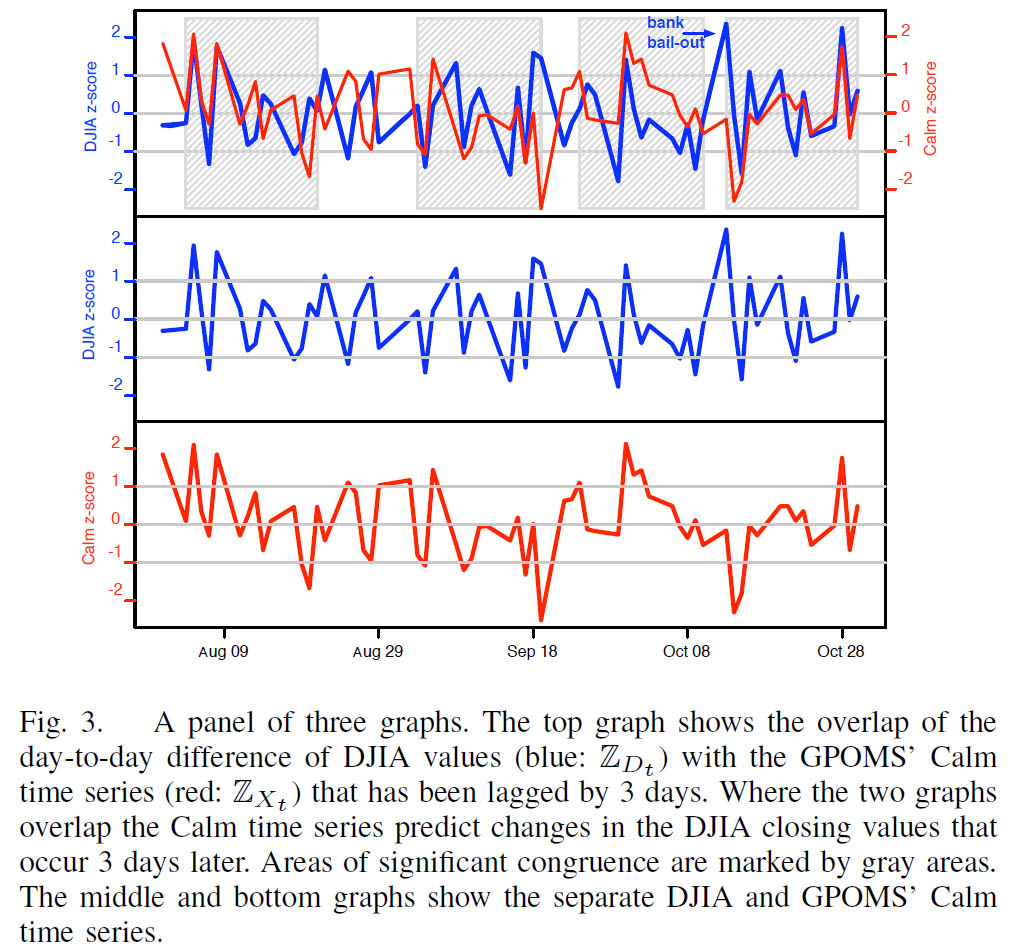
Note then that the assessment of predictive power later uses these z-scores, which are clearly not out-of-sample since they incorporate $k$ periods of future knowledge. Figure 3 and its caption below drive this point home, as they clearly indicate that $Z_t$ is used here.
The remainder of the text is somewhat ambiguous.
I've emailed the authors twice over the last week, and despite the fact that they visited my personal homepage through the email, I've received no response. In the meantime, I think the jury is out on whether Twitter can actually be used to rigorously, out-of-sample predict the stock market.
Despite the recent decline in front and future VIX prices, many traders have recently taken speculative positions on increasing price ranges. I decided to highlight the ten exchange-traded assets that had the widest weekly ranges as a proportion of Friday's closing price. In addition to presenting just the range, I'm also providing the week's return, total dollar volume, and correlation to the S&P and gold.
| Symbol | Return | Range | Dollar Volume ($M) | SPY Correlation | GLD Correlation |
| TMF | -11.1% | 15.3% | 28.461793 | 94.3% | 66.0% |
| TYP | -11.2% | 15.1% | 59.262521 | -41.9% | 55.7% |
| ZSL | -10.5% | 14.7% | 64.935627 | -5.7% | -93.7% |
| SQQQ | -10.6% | 14.5% | 163.841642 | -39.0% | 59.1% |
| CZM | 7.9% | 13.3% | 25.011599 | 69.7% | 91.9% |
| CZI | -7.7% | 13.2% | 2.204423 | -77.5% | -82.7% |
| TMV | 11.0% | 13.2% | 103.653646 | -95.4% | -63.2% |
| FAS | -5.5% | 12.8% | 4001.066165 | 64.8% | 28.1% |
| TYH | 10.6% | 12.7% | 144.928741 | 43.9% | -56.6% |
| TZA | -4.4% | 12.6% | 2530.503744 | -77.6% | -87.2% |
The results shouldn't be too surprising. The pack is led by leveraged funds that track technology, Treasury, and commodities. TYP, TYH, and SQQQ all correspond to triple-leverage Nasdaq or broad tech funds; of these, TYH and SQQQ were much more heavily traded this week. Treasury funds hold their own as well, with the triple 20-year (TMF) and the triple short 30-year (TMV) showing large ranges this week. ZSL is a double-leverage short silver fund, and CZM/CZI are triple-leveraged long/short China funds; much of the move in both Chinese and commodity markets this week was driven by the dollar. Of all these funds, the triple-leverage financial ETF (FAS) clearly saw the most trading action, churning more than $4B this week. With plenty of housing, job, and industrial data out next week, look for these funds to continue to expand on their recent price ranges.
I regularly publish papers on arXiv.org, an open-access archive for research in physics, math, computer science, and (recently) quantitative finance. I also subscribe to digest updates on recently published research.
Edit: It’s unclear whether the in-sample issue actually affects the prediction or whether this is only used to compare OF and GPOMS. Though the regressions are written using X_t and not Z_{X_t}, Figure 3 and its accompanying interpretation clearly compare the z-scores of $DJIA and their chosen signals.
I noticed an interesting paper hit the digest tonight: Twitter mood predicts the stock market. Though I haven’t read it in detail, the paper suggests that sentiment analysis of Twitter can be used to improve the prediction of market direction. My quick scan of the paper found it to be mostly out-of-sample, though it appears that the OpinionFinder (OF) and Google Profile (GPOMS) data are normalized with symmetric windows that do incorporate in-sample data. However, the degree of improvement in prediction suggests to me that this sentiment analysis might improve prediction even when this issue corrected. Below is the abstract and full citation:
“Behavioral economics tells us that emotions can profoundly affect individual behavior and decision-making. Does this also apply to societies at large, i.e., can societies experience mood states that affect their collective decision making? By extension is the public mood correlated or even predictive of economic indicators? Here we investigate whether measurements of collective mood states derived from large-scale Twitter feeds are correlated to the value of the Dow Jones Industrial Average (DJIA) over time. We analyze the text content of daily Twitter feeds by two mood tracking tools, namely OpinionFinder that measures positive vs. negative mood and Google-Profile of Mood States (GPOMS) that measures mood in terms of 6 dimensions (Calm, Alert, Sure, Vital, Kind, and Happy). We cross-validate the resulting mood time series by comparing their ability to detect the public’s response to the presidential election and Thanksgiving day in 2008. A Granger causality analysis and a Self-Organizing Fuzzy Neural Network are then used to investigate the hypothesis that public mood states, as measured by the OpinionFinder and GPOMS mood time series, are predictive of changes in DJIA closing values. Our results indicate that the accuracy of DJIA predictions can be significantly improved by the inclusion of specific public mood dimensions but not others. We find an accuracy of 87.6% in predicting the daily up and down changes in the closing values of the DJIA and a reduction of the Mean Average Percentage Error by more than 6%.”
Johan Bollen, Huina Mao, Xiao-Jun Zeng. Twitter mood predicts the stock market. arXiv:1010.3003
